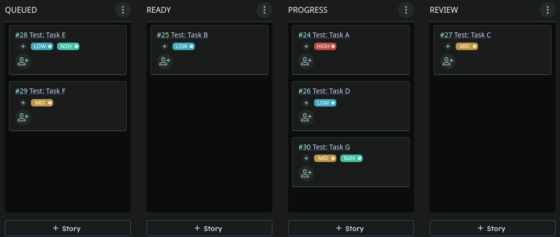
Currently, it is sometimes challenging to maintain an overview when the Kanban board is overflowing with stories. Then it becomes difficult to set priorities. Of course, stories can always be sorted into specific columns. However, if several stories are in-progress because work is already underway on them, it could be practical to prioritize stories with Tags.
Idea:
On each story there could be a small “+“ sign to add Tags which can be defined in the projects settings (color and name), similar to how it works in some email inboxes. Here is a rough mockup of how it could look like:
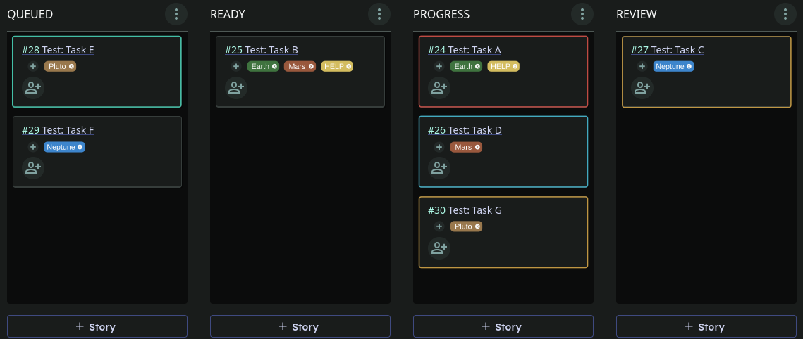
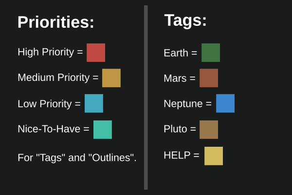
These Tags are now all related to priorities. But sometimes it might make sense to have just regular Tags to categorize stories. However, regular tags would quickly become mixed up with the priorities. In this case, how about using regular tags as above, but adding a second layer for priorities in the form of a colored outline around the whole story? Here is a rough mockup showing what Priority Outlines and Tags combined might look like:
Note: Tags and Priority Outlines could be optionally activated in the settings. Since depending on the workflow, these may not be needed or may unnecessarily clutter the UI.
What do you think? Could “Tags” and “Priority Outlines” be useful additions?
Thank you so much for your suggestion, providing mockups is absolutely awesome!
Having tags is a definite yes, it is one thing we plan to tackle on soon (we are in the discovery phase for it). I do need to find the time to fill up our roadmap a bit more in advance as they are many things we plan to do missing from it still.
Your suggestion about priorities will certainly give us food for thoughts as we do want to facilitate using MoSCoW eventually. For now, we recommand sorting by priority on the vertical axe, but I know this solution is lacking because it gives no way to visualise priority in-between columns.
Thank you very much for your detailed reply. It’s great to hear that you’ve already planned something like this. And with the MoSCoW method sounds interesting too.
As mentioned on the roadmap, Storymapping would also be very interesting in this regard. I think it would also help to prioritize things a lot better.
As you suggested, I already kinda use this method to prioritize tasks. However, for me it is always more intuitive when I can distinguish between tasks visually (i.e. with colors), especially when there are a lot of them.
Nevertheless, I’m looking forward to seeing how all these things evolve.
Hey @jrymer,
very cool to have tags available now in Tenzu
That makes organizing stories so much better.
I assume the available colors of the tags have been specifically chosen to match the themes or to remain easily recognizable. Would it be possible in the future to have more colors. Nothing fancy more like an optional hex color input for custom colors?
The chosen colours have been chosen both to match the theme and to be as much accessible as we could make them regarding colour contrast.
We thought about adding the possibility of custom colours, but didn’t yet. If we know all the provided colours, then we can adapt them as needed:
adjust for the dark theme
in the future, provide a mode for people with different colour vision troubles to chose more discernable colours for them.
All this we can only do with a fixed palette that we can transpose to another one, we cannot do this on a user chosen colour. Hence our choice. We are not opposed to revisiting this in the future, but it won’t be a priority.
We hope to at least be able to add more colours in the future when we have more time for it, the provided palette just seemed like a good start for now :)
Is your question because you feel like there aren’t enough colours or because you would have preferred to be able to chose some?
Thank you for the explanations. That definitely makes sense!
It’s not necessarily that there aren’t enough, it’s more a question of being able to specify them exactly.
As an fictional example if the tags are used to categorize different streaming platforms, it could be meaningful to have tags that match the streaming platform’s brand color like:
Netflix = #E50914
Prime Video = #1399FF
Paramount = #11518a
However, I would see them as optional additional tags created by the user, as it certainly makes sense to have a default palette that matches the theme and is balanced overall.